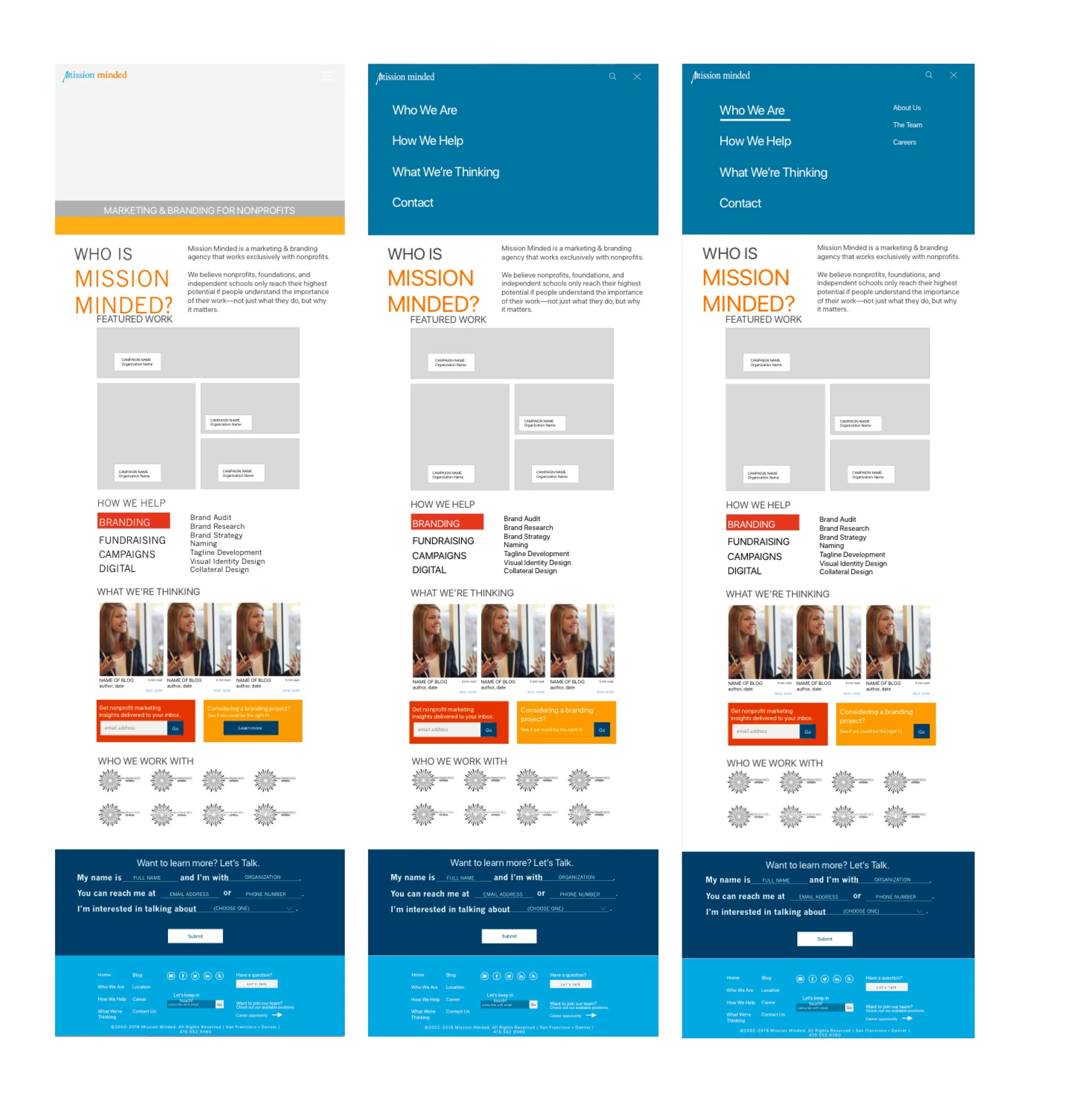
Check out Mission Minded’s updated website, based on my designs!
Mission Minded
Mission Minded is a branding and marketing agency that works exclusively with nonprofits. They "believe nonprofits, foundations, and independent schools only reach their highest potential if people understand the importance of their work—not just what they do, but why it matters."
Project Summary
My team was paired to work with Mission Minded to redesign the homepage and two secondary pages of their website, to more accurately represent the work they produce for their clients. For the research portion, we interviewed eight users, did a competitive analysis, affinity mapped, created personas and conducted a series of card sorts. Along with the business goals of Mission Minded, we used this data to restructure the information architecture of the site as well as the layout and visual design of the homepage, services page, and portfolio landing page. I took the role of Project Manager as well as the lead on visual design.
Research
User Interviews / Affinity Mapping
We spoke with eight users of Mission Minded's website, including: potential clients, current clients, future clients, and members of the Mission Minded team. We took the data from these interviews and created an affinity map, pulling out key themes and insights. After transcribing the interviews onto note cards and affinity mapping, some of the top themes that emerged were:
Mission Minded's existing website: homepage, portfolio landing page, services page.
It's important that Mission Minded works exclusively with nonprofits
It's important to see past work that Mission Minded has done and clients that they've worked with
The current website is not as warm and visually appealing as the websites Mission Minded produces for their clients
Information Architecture
To restructure the information architecture of the website, I looked at competitor sites, performed a series of card sorts, and looked at the Google Analytics of Mission Minded's existing site. For the competitive analysis, I looked at Mission Minded's major competitors, to figure out which visual design aspects and navigation components were most commonly used. I found that the four most common breadcrumbs were "About Us", "Our Work", "Contact" and "Blog". The card sorts gave us similar findings, and the Google Analytics helped us prioritize the order of the pages.
Most visited pages on the website.
New information architecture, based on Google analytics, card sorting, and competitive analysis. One recommendation was that the testimonials page be eliminated, as it rarely receives visits. Instead, testimonials should be scattered throughout the other "How We Help" pages.
Personas
Based off of the user research and business goals of Mission Minded, I created three personas that I kept in mind during the design of the website.
Word of Mouth Mary is the primary person I designed for, as she represents most of the users we spoke with during our interviews.
Design
Wireframes:
I took the lead on visual design for this project, but the design process for this project as a whole was collaborative. I started with paper sketches of the homepage but quickly moved into Sketch, as the research portion of this project was so robust that I was quickly able to turn my ideas into designs.
Based on our research, we knew that we wanted to highlight and prioritize certain elements of the website on the homepage, including:
Portfolio work
Blog and other content resources
Services
Past clients
An easy way to contact Mission Minded
Shown below are three possible wireframe solutions for the homepage.
Our team started combining visual elements from each of our designs. From this process, we produced our first mid-fi mockup of the homepage.
User Testing
I put together a prototype of our screens to conduct some user testing before moving forward with final designs. From our user testing sessions, we learned a few things:
“The typeface is too big.”
“The content calls to action don’t really make sense to me.”
“The natural language contact form looks like it’s already filled out - I didn’t immediately know what to do with it.”
Based on this feedback, I made changes and retested, to make sure I solved the problems in our designs. Ultimately, I was confident in both the visual design itself, and the reason and research behind each design decision.
Below are the designs presented to the clients:
Final revisions
See the live implementation of my design.
Our clients were overall happy with decisions we made and the look and feel of the actual designs. They did request a few changes, which we implemented into the final design of the homepage:
Make the language on the site more user-centric
Add more video content
Create a carousel so more testimonials are shared
Final thoughts
Mission Minded's existing website does not accurately represent who they are as a company, or the quality of work they put out for their clients. Our research-backed design decisions will better represent their work and create a warmer overall feel, while also helping them achieve their top business goals.


